Hyperfixation
A few days ago I was reminded that it’s almost October, which is not only Inktober, but also ADHD Awareness Month, which I spent last year getting a thorough neuropsychatric evaluation. Someone also told me that there is an ADHD Awareness Ribbon, AND IT’S MY FAVOURITE COLOR!!11 Ehm, sorry1 about that.
Anyway, so I went ahead to change the accent color on this piece of web, that I don’t use that often, and probably noone follows. So, it used to be a bright Pumpkin Orange which is completely different from the darker ADHD Orange2.
Well, to do that I had to look that the SASS and Jekyll/Liquid that it’s made of. 🙈
Four? hours later I was inexplicably HANGRY, but somewhat pleased with what I’d accomplished. Suddenly another four? hours passed, but at least I had eaten something? But it was well past midnight, and work day after. git push
Just a few quick stabs at things during breakfast, before work. git push
🙀 I broke the site menu for narrow displays! For all the zero visitors during the whole day until I could sit down and fix it, after work. Somehow I had dinner at almost midnight-ish. Again. But it was all done, with pagination rewritten from scratch, because apparently that needed to happen. Not perfect, but good enough.
Breakfast, playing around with the pagination buttons. 🙀 The pagination gets all messed up in a corner case.
git push Four minutes until daily roll call at work. 😅
I was going to quickly change #FF963E#F15A29, but got hyperfixated3 for a few days, maybe I still am. I guess I’ll know tomorrow.
Hi, I’m Calle, I have ADHD.
git push
Follow-up
Hyperfixation Revisited
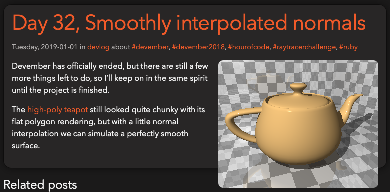
 For some reason I found myself browsing my old blog posts, when I got assaulted by this scene, as straight out of a horror movie.
And while I was adding @extend %clearfix in places, I also thought I’d fix some other layout imperfections I noticed, and all of my morning disappeared; time to make coffee and “go to” work.
Down the rabbit hole again
This was also the first time I’ve made a follow-up to a specific post, instead of referencing earlier posts in a series on a given theme, so I needed to make that kind of relation stand out.
While doing this, I had found horrible abuses of <ul> and <li> wrappers for vertical layout, so I ripped those out and flattened the DOM tree a bit. With this the actual blog post got promoted to be the main content, instead of just another list item with the related posts, so that’s nice.
Now I’ve started thinking, and I should take a look at making a light theme for those who have not yet embraced the darkness; so investingation of media queries for that, and switch to using custom CSS properties instead of SASS variables for the color theme. That way I can wrap the color theme setup in a media query to get automatic switching, depending on the viewer’s preference.
Next related
Further down the rabbit hole
Hello darkness, my old friend
